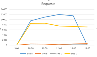
As I have been using iView, I see what seems to be a glaring omission, or am I missing something. There are no line charts, just bar charts and pie charts. Without line charts, you can't present data in a graph that shows usage over time.
Take the Web Server Protection data. It's a bar chart. We have several websites, one that is heavily used. You can only see one bar. The others are so small that they don't even show up. Also, no matter how large the time range, you still only have one bar, just the numbers get larger. I can't see how much traffic each site generated each day of the week.
Even the UTM reports have line charts on the Web Protection reports. Unfortunately you can't drill down to individual domains/services.
This thread was automatically locked due to age.


