This discussion has been locked.
You can no longer post new replies to this discussion. If you have a question you can start a new discussion

Real Bandwidth usage - Control Center which one is correct?

Hi All,

After years of XG usage, I still cannot understand in the CC which graph is the correct one. I only have one user role and look at the graphs that CC reports:

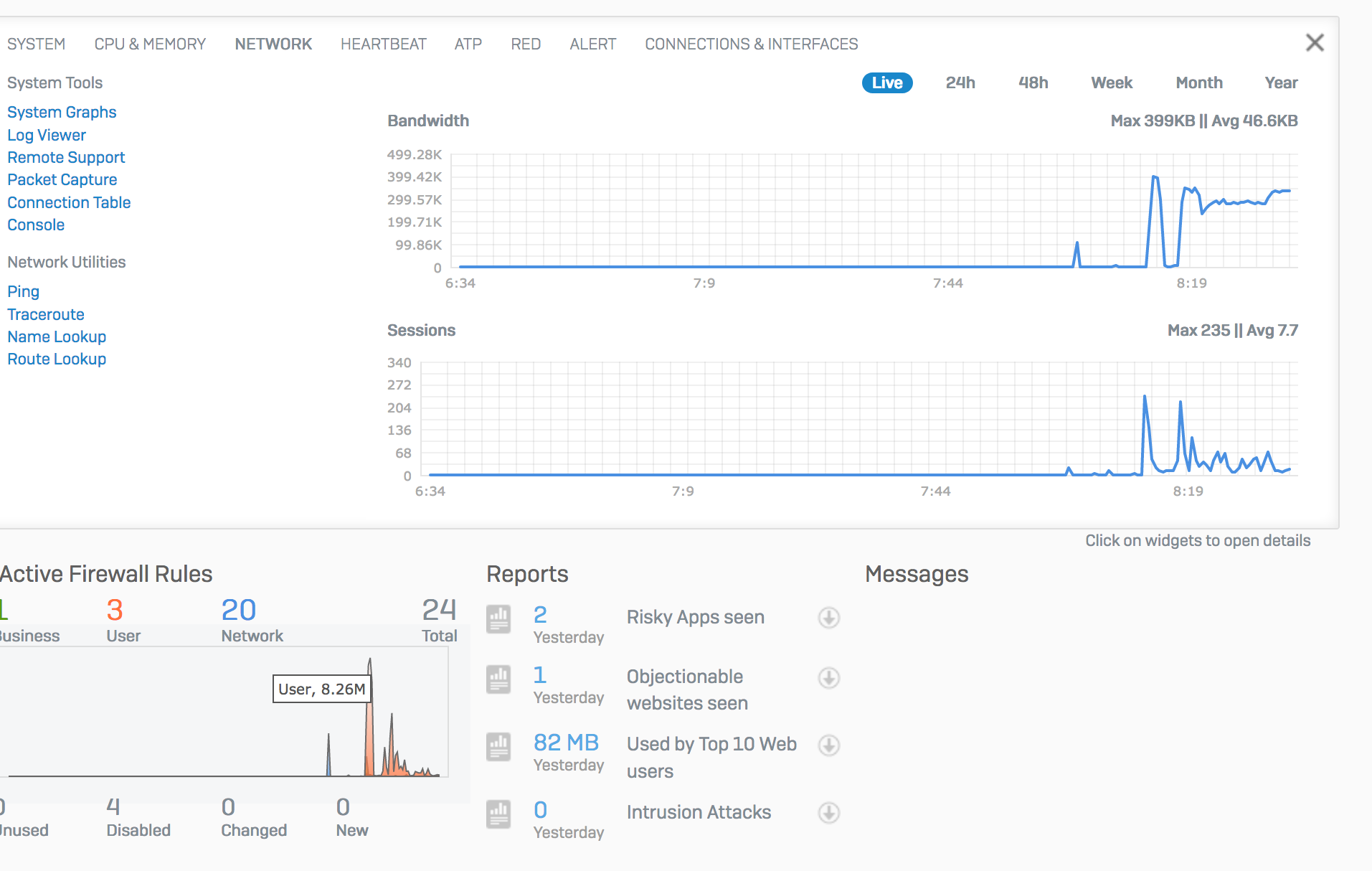
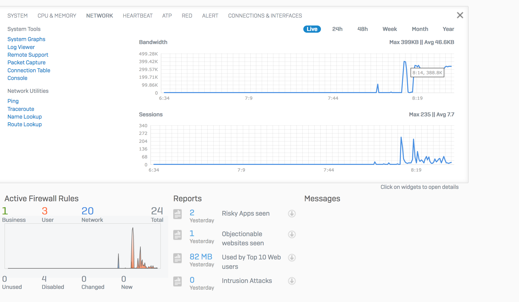
Looking at the command line output:

system diagnostics utilities bandwidth-monitor

it reports like "bandwidth graph". I have a 100Mb at home and I never reach more than 8 Mb behind XG. Yes I know about IPS, Web Proxy and Anti-malware scanning but graphs are not reporting correct information at all. This is the feeling I have.

What about other guys on Community?

Regards


This thread was automatically locked due to age.
Parents
  • I liked the control center design compared to UTM when it was first introduced in XG15 but they haven't improved it since then and there is no real data in those graphs. Just a selling tool to overwhelm a new user with the wow factor of "LOOK" at all that info right at your fingertips.

    Looking at live traffic is worthless. I glance at the control center once in a while to see the web/application categories breakdown and if there are any blocked apps that I need to be concerned with.

    The actual bandwidth (circled in red below) is the 30 second snapshot of your current bandwidth being used. It always looks low to me but probably to control large spikes in graphs, they are trimming small spikes so its probably not too accurate.

    The Active firewall rules graph shows the total bandwidth used by the rules in 30 seconds and is worthless also unless you have some kind of data cap and are concerned about a single firewall rule using too much data.

    Web activity which takes most of the screen is totally worthless and I haven't found why its even there.

Reply
  • I liked the control center design compared to UTM when it was first introduced in XG15 but they haven't improved it since then and there is no real data in those graphs. Just a selling tool to overwhelm a new user with the wow factor of "LOOK" at all that info right at your fingertips.

    Looking at live traffic is worthless. I glance at the control center once in a while to see the web/application categories breakdown and if there are any blocked apps that I need to be concerned with.

    The actual bandwidth (circled in red below) is the 30 second snapshot of your current bandwidth being used. It always looks low to me but probably to control large spikes in graphs, they are trimming small spikes so its probably not too accurate.

    The Active firewall rules graph shows the total bandwidth used by the rules in 30 seconds and is worthless also unless you have some kind of data cap and are concerned about a single firewall rule using too much data.

    Web activity which takes most of the screen is totally worthless and I haven't found why its even there.

Children
No Data