Recommendation to Halt the Rollout of Sophos' New Interface

I wanted to share some feedback regarding the recent changes to the portal page. While I appreciate the efforts to enhance the interface, I have some concerns about the usability of the new layout, particularly regarding the drop-down menus.

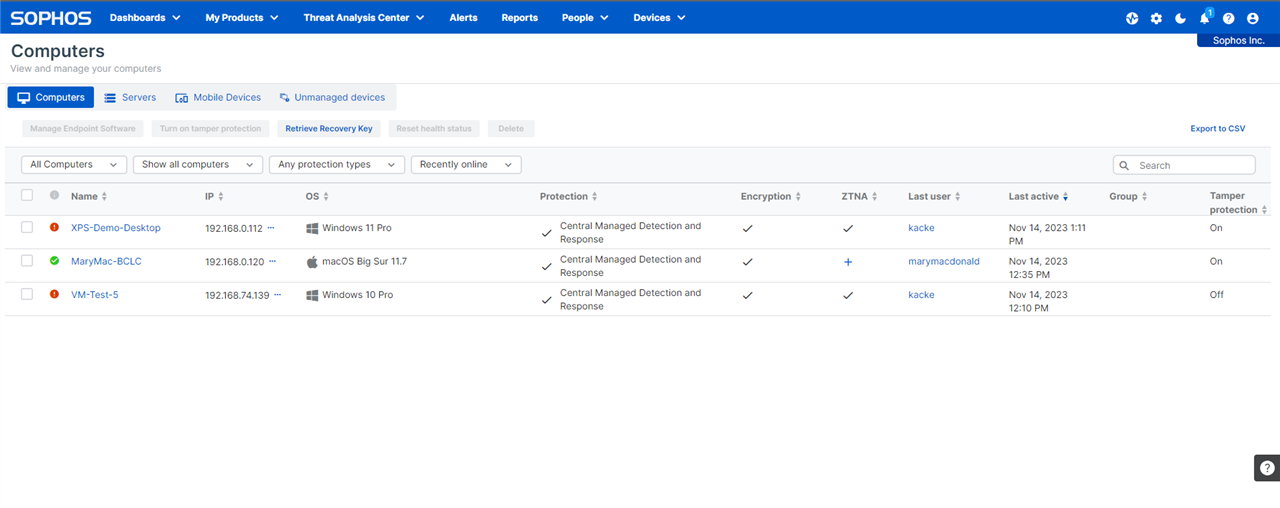
In the current design, accessing information requires additional clicks. For example, on the existing page, I can easily click on 'Devices' on the sidebar and instantly view all my devices. However, in the new layout, this process is less straightforward. To see the same information, I now need to navigate through multiple steps: selecting 'Devices', then 'Computers', and again 'Devices' to access 'Servers'. This not only adds extra steps but also prevents viewing all devices on a single page, which is less efficient for quick checks and management.

Additionally, I noticed the button to switch to the new interface is prominently displayed, but the option to revert to the classic view is less accessible, tucked away in the profile menu. For better user experience during this transition phase, it would be beneficial if the option to switch back were as easily accessible as the option to try the new layout. This would allow users to more seamlessly compare and choose their preferred interface.

I understand that these changes are part of ongoing improvements, and I appreciate the opportunity to provide input. Thank you for considering this feedback as you continue to refine the user experience

Parents
  • Hi  - Thanks for taking the time to provide your honest feedback.  The ability to change back to the original navigation was intentionally placed in the user profile to reduce a potentially nagging button at the bottom of the screen, so we will be more mindful of this in future projects.

    The ability to simply click on "Devices" vs. needing to select a specific item is a great call out to consider potential changes in the future.  To clarify, when you are already in the devices/computers page you should not have to reselect to the Device drop down, then select "Servers"  to see the "Servers" or "Mobile" devices within that page. Since this is a tabbed page, when you select any of those items in the drop down we are simply taking you to the appropriate tab while the other tabs on the page remain accessible.  It should look similar to the below. Let me know if I have misunderstood what you are describing. Thanks again for the feedback!

Reply
  • Hi  - Thanks for taking the time to provide your honest feedback.  The ability to change back to the original navigation was intentionally placed in the user profile to reduce a potentially nagging button at the bottom of the screen, so we will be more mindful of this in future projects.

    The ability to simply click on "Devices" vs. needing to select a specific item is a great call out to consider potential changes in the future.  To clarify, when you are already in the devices/computers page you should not have to reselect to the Device drop down, then select "Servers"  to see the "Servers" or "Mobile" devices within that page. Since this is a tabbed page, when you select any of those items in the drop down we are simply taking you to the appropriate tab while the other tabs on the page remain accessible.  It should look similar to the below. Let me know if I have misunderstood what you are describing. Thanks again for the feedback!

Children
No Data