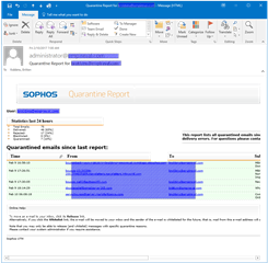
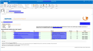
Can anything be done to make the Quarantine Report email a more narrow, fixed width?
The current one is so wide the users are missing the release and whitelist links because they aren't used to having to scroll emails horizontally.
This thread was automatically locked due to age.


