This discussion has been locked.
You can no longer post new replies to this discussion. If you have a question you can start a new discussion

Idea for Access Point Tab

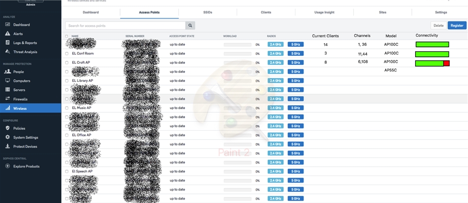
Alright, first things first, no-one make fun of my Paint skills, they are terrible.   But looking at the Access points tab, theres alot of blank space that could be used for some valuable information at a quick glance.  Below is an idea where you could add some different columns for different information.  This is just an idea, there might be some other info that would be good.  Or maybe you can pick and choose what you want seen there?  Anyway, just a thought.

Also I put this on another thread, but notice the workload of these AP's.  Of these 20 or so APs shown on that screenshot, theres probably well over 100 clients connected to them right now.  After a couple refreshes it might show some data on those bars.

Thanks

~Dan~


This thread was automatically locked due to age.
  • Hi,

    the current page layout is adjusted to work with smaller screens. For example we just adjusted the client page to hide some columns on smaller screens. This is why the columns are limited and you see a lot of space on your screen at the moment.

    We plan to add sortable + customisable columns. We track it internally with CWIFI-4717. These should then also include your suggestions.

    The client count issue is a bug we track with CWIFI-4697. We will update you when the fix for this issue is deployed.

    btw: the graphic was very helpful and good to read. Made it easy to understand what you want.

    Kind regards,

    Dirk Bolte