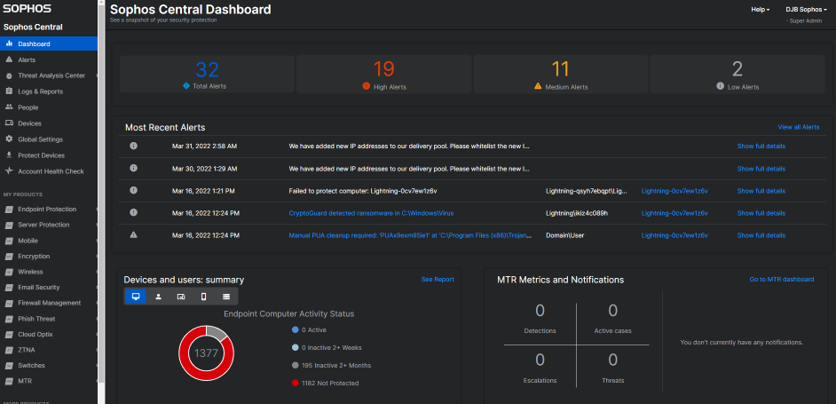
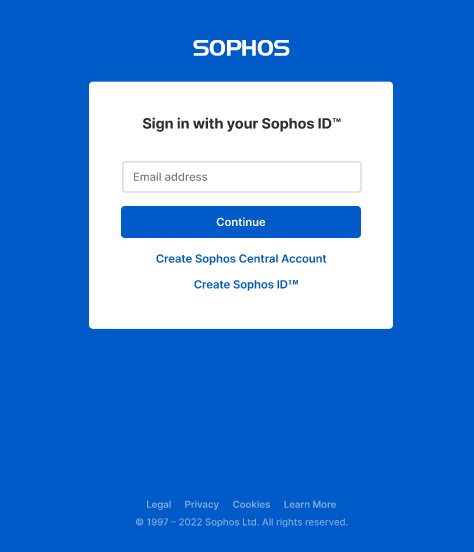
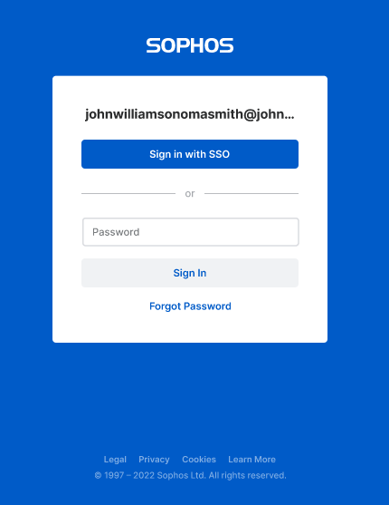
In early July, Sophos Central sign-in screens and user interface will get an updated look and feel. While no functional changes are occurring, the user interface throughout Central will get:
- Updated colors
- Clean and modern font
- Updated icons
- And... dark mode support!
Central sign-in, and MFA screens are also getting a face lift to match!
Be on the look out for these changes coming soon!


-

Nathan Holmes1
-
Cancel
-
Vote Up
0
Vote Down
-
-
Sign in to reply
-
More
-
Cancel
Comment-

Nathan Holmes1
-
Cancel
-
Vote Up
0
Vote Down
-
-
Sign in to reply
-
More
-
Cancel
Children