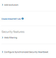
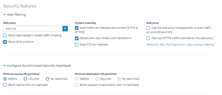
Like V15, you need to scoll and extend too many things to see or configure a complete set of parametres ...
For exemple, web filtering. you normaly need to see the set strategy when you edit a rule ! Now you need to extend ...
same for synchronized Security ...
Why doing this way ? the place taked by the topic are the same as extended menu !
So many white space ... lost of time to scroll for nothing !


